

Editorial approval decided on a different viewpoint (action seen from above) and an old Michael Golden Micronauts cover proved inspiring (a second Wolverine issue was also shown) Big Show was still to be surrounded by many more bad guys all with the same intent. Below is the next sketch design.
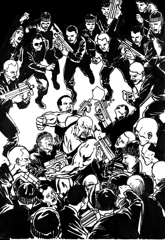
After further approval, we moved on to inking (and the addition of more bad guys was suggested) This was kinda easy as we just Photoshop'd and flipped some of the foreground figures at the top of the page (to be hidden by the WWE logo anyways!) This helped make for a pretty intense and crowded action-packed cover! As before (with the Elephantmen cover) most of the elements were on seperate files to allow for re-compositing and positioning. This was especially welcome because of the initial change of viewpoint and the number of figures to be included.
You may notice in the inked version below that the guns were also changed from MP25s to a rail gun devices.

Next up, colour. I submitted a rough colour sketch with a primary downlight source from above. This key light helped focus (and highlight) the figure of Big Show and allowed for a darker surround of figures (merging into the inky blackness)
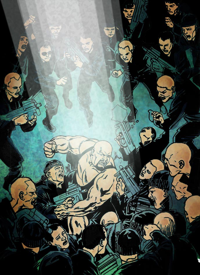
The final colours were put down and a 'grease' layer was applied to give a dirty feel to the environment (an sewer or old warehouse?) I kinda liked that Matrix green look of the overall piece. The key light also helped pick out Big Show a treat!

Unfortunately the colour was not approved (too dark and gritty) and Jamie Grant was brought in to rework the cover. I was delighted with the end result. The characters pop more.


The final inked piece is pretty full on. Did you know how much was going to be lost by the logo? Although the final inked piece looks superb with all the extra bodies at the top I can't help thinking that you could have saved yourself a lot of time on the job by not filling in the space where the logo went.
ReplyDeleteI also prefer your colour on the piece, I understand why they wanted to change it but I think your colour scheme at the front helps make the light hitting the wrestler stand out more. Again though a lot of that light as you have it would be lost by that big logo.
Overall a great cover and great talk thru.