Saturday, July 31, 2010

A little bit of Peace

I'm 'in between jobs' at the moment , which isn't a euphemism for 'unemployed' far from it. I'm gearing up on 'Knives of Glory' for FirstSecond Books which will take me to Xmas at least. Then I'm also working on a pitch or 2 for the project that's likely to come after that...or after the thing that comes after that, which is likely to be more Dante.
So this project is called 'Peace' it's set in ancient Athens during the Peloponnese War, stars Aristophanes and is written by my old pal Martin Millar.
Affluent, Hellenophile publishers can contact me through this Blog.

Friday, July 30, 2010

Ah, ta hell with it


Couple of pages of Constantine from my characters sketchbook this week. Only recently got back into Hellblazer so working through some trades just now - all good stuff.

Thursday, July 29, 2010

Dan Dare: Evolution of a page.

Another Evolution of a page this week. With all the interest shown last week for the Warner Bros. option of Dan Dare and the possiblibility of Sam Worthington chosen as our lead, I decided to focus on the the Dare series I worked on a couple of years ago with Garth Ennis.

This post features the final page of issue seven featuring Willis charging ahead out of the back of the carrier headlong ino the action. With him is Christian and the Doctor. Garth's panel description was very spare but ALL the necessary information was there. The doctor was to look scared, Christian resolute (draggin him along) and Willis 'fired up' for the skirmish on board the Treen craft.

Like most pages I start with a thumbnail in the margin of the script page (which also shows panel layout) This is enough for me to provide a rough sketch of how the page should look. This is drawn using a biro pen on an A4 pad. Lots of energy and vibrancy when doing this. This is the best part of the creative process for me. Everything after this stage is just more refinement!


After some minor editorial comment and suggestions from Garth I move on to pencils. details are refined and the image and composition starts to become clearer. Some figures are moved slightly but still very much the same as the original sketch (and thumbnail)


After a quick pass from Garth and the editor I move on to inks. More refinement of the lineart and I get lost in the detail.


Colour is added and the original decision to have a red light flooding the scene ended up lookin overdone and heavy. We tried some less saturated versions but in the end the final choice was to keep it subtle.


This final version is much cleaner and works for me. The energy from that first sketch still jumps off the page and the subtle work by colourist Parasuraman on the muzzle flares and ricochets helps the overall image. Delighted with this and the resiof the book.

Wednesday, July 28, 2010

Shadowrun


Older work from the Shadowrun RPG (not the console game sadly), done with pencil and digital. Sometimes I look back over old work and am ashamed. Sometimes I wonder how I pulled it off (the answer to that is usually just lots and lots of time).

The property has changed hands since I did the image, but I think it is (C) Catalyst game labs

Tuesday, July 27, 2010

Blistering Barnacles!

Graeme Neil Reid,Illustration

A few weeks back I showed you my 'Just One Page' charity illustration of Collina versus the Hulk, well this illustration was my contribution the year before. The Punisher versus Tintin.

Monday, July 26, 2010

Jonday - Havering Adventures

Scotch Corner exclusive! Haven't posted this anywhere else, AND I'm even posting on time, on the right day.

A cover for Cubicle 7 Ltd, producers of fine role playing games. And wot for whom I are doing art direction. Which is an interesting adventure and no mistake. This one is for a book of adventures for Victoriana, an alt history/steampunk rpg. The book is based around the Havering Family, and here we see their band of hardy souls. Please not this has nothing to do with the Scottish use of the word "havering".

Image Hosted by ImageShack.us

Embiggerizor:

Saturday, July 24, 2010

ARMIES of the Damned


As any self respecting Comics Artist will tell you, there are few words in the English language that can inspire more dull, gnawing dread than the word 'Army'. Such a small word, so easy to write, yet such a MAJOR pain in the ass to draw!
In this case the script specified 2 armies ( plural , even WORSE! ) viewed from overhead ( !! ). This is the kind of direction that undermines the Writer/Artist working relationship. Do you hear me Morrison!!!!

Friday, July 23, 2010

Exploited


Still clearing out my old folios and stumbled across this - another Marvel UK commission that never saw the light of day. I had completely forgot i had even done this one and only have a poor photocopy of the pencils (don't know if it was ever inked or not). It was supposed to be the cover to an issue of Exploits of Spider-man which reprinted a very early Spidey Daredevil team-up (hence DD's original costume) I believe the main reason it was not used was that it was deemed to not be 'Jim Lee' enough at the time (but looking at it now it could well have been some dodgy anatomy on Spidey that sunk it as i had still never taken a proper art or life drawing class at this stage)

Thursday, July 22, 2010

WWE cover. Evolution of a cover.

Another Evolution of a cover post. This features my alternate cover for Titan Books WWE series. The original brief was for Big Show to be surrounded and attacked from gun-wielding, black-clad bad guys. A familiar Frazetta Conan image was used as the initial inspiration and a pyramidal design was chosen with our lead wrestler atop. The sketch below was the first draft.


Editorial approval decided on a different viewpoint (action seen from above) and an old Michael Golden Micronauts cover proved inspiring (a second Wolverine issue was also shown) Big Show was still to be surrounded by many more bad guys all with the same intent. Below is the next sketch design.


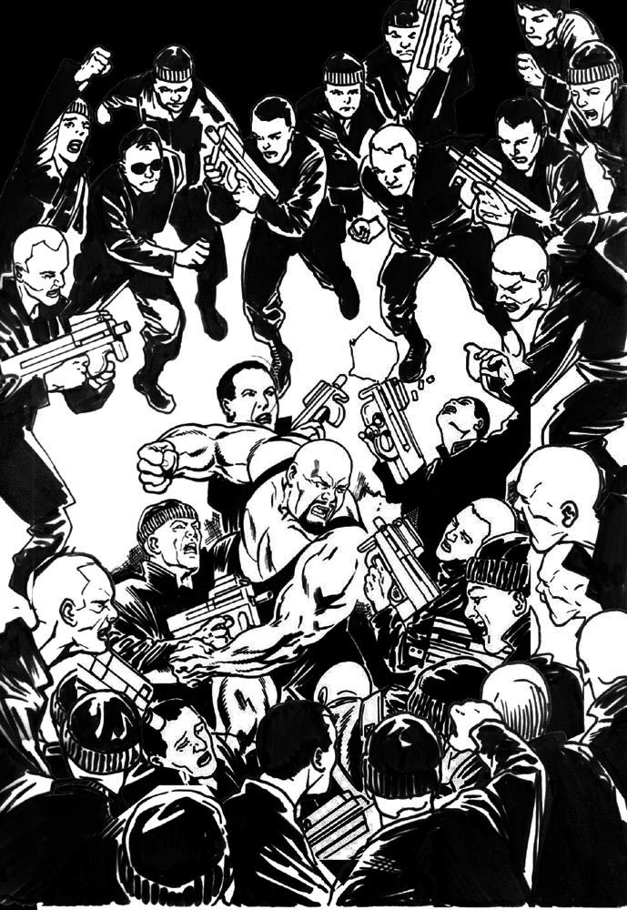
After further approval, we moved on to inking (and the addition of more bad guys was suggested) This was kinda easy as we just Photoshop'd and flipped some of the foreground figures at the top of the page (to be hidden by the WWE logo anyways!) This helped make for a pretty intense and crowded action-packed cover! As before (with the Elephantmen cover) most of the elements were on seperate files to allow for re-compositing and positioning. This was especially welcome because of the initial change of viewpoint and the number of figures to be included.

You may notice in the inked version below that the guns were also changed from MP25s to a rail gun devices.


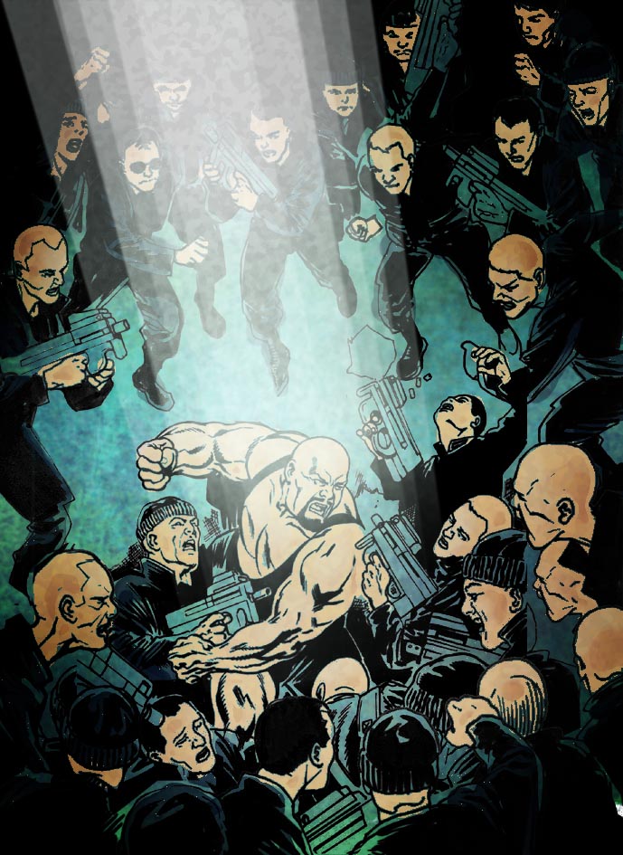
Next up, colour. I submitted a rough colour sketch with a primary downlight source from above. This key light helped focus (and highlight) the figure of Big Show and allowed for a darker surround of figures (merging into the inky blackness)


The final colours were put down and a 'grease' layer was applied to give a dirty feel to the environment (an sewer or old warehouse?) I kinda liked that Matrix green look of the overall piece. The key light also helped pick out Big Show a treat!


Unfortunately the colour was not approved (too dark and gritty) and Jamie Grant was brought in to rework the cover. I was delighted with the end result. The characters pop more.

Wednesday, July 21, 2010

from the vault


well, its not actually that old - a couple of years? But I only found it in a fit of desperation while looking for something to post this week. The first page of a five or so page intro to an online game about a professor's journal, a detective game if my out of date guesswork is correct. One of those jobs which had to be turned around very quickly, and I think this was one of my first experiments with the Manga Studio drawing program (a nice inking/screen toning tool).

Tuesday, July 20, 2010

Something a bit fishy!

Graeme Neil Reid,Illustration

From Doctor Who 'The Underwater Menace'. Did a bit of updating on him/it but its pretty much the original design without BBC budget restrictions :)

Monday, July 19, 2010

Jonday - Whoops

Umm here's a medieval/fantasye taverne I made in Sketchup. If you want the model then just ask in the comments.

Image Hosted by ImageShack.us

Saturday, July 17, 2010

Lawyer humour

My upstairs neighbours are lawyers ( Hi Eugene, Hi Emily ) , apparently this drawing that I did is very funny if you were involved in this case where this guy lied his ass off then got skewered in cross examination.
I'd put his name here except that ...well......he's a Lawyer!.


Friday, July 16, 2010

Starchild


Cover design for a kids Sci-Fi novel. The 'kid' pictured was actually in her late twenties (possibly even early thirties) but with a bit of photoshop jiggery pokery that age was reduced dramatically. Basically it's the left side of her face twice - flipped over for the right hand side, merged and then stretched and distorted a bit and blemishes cleaned up.

Thursday, July 15, 2010

Transmetropolitan - Beja Festival, Portugal.


This week's post is actually a painting by another artist.

Mhairi and I were invited to the Beja Festival event last year and had an amazing time. I got to meet some brilliant and talented artists and writers from Europe including the amazing Mattotti. There was a gallery for each of us. My own gallery featured Lords of Misrule artwork, Hypersonic pages and my Transmetropolitan spread for I Hate It Here. It was the main element of this piece that was beautifully re-created as the introduction to the collection.


This gorgeous image was hand-painted by a friend of the event organiser. We were genuinely stunned and impressed with the detail. Lovely work. All the invited guests had illustrations provided by local artists. Unfortunately I forgot the name of the woman responsible (much to my shame) but I did provide her lovely daughter with a lovely Hello Kitty.

It was this community spirit to help the event that really impressed me. A complete love of the comics medium and a willingness to be part of the whole exhibition. More photos are on my Facebook page here.

Thanks to everyone who made Mhairi and myself feel very much at home at our first European event.

Wednesday, July 14, 2010

Vampire pencil draft


Here is the initial pencil work for the vampire gal posted last week. There are a few changes, in the angle of the head, in accessories, little adjustments here and there to both the figure and the surround. This version is a little too... soft? in the vamp's attitude, I think, and the comments from the company really helped to push it in the right direction.

Tuesday, July 13, 2010

Reach for the sky...

Graeme Neil Reid,Illustration

Chocks Away! If he looks a little off balance he does have fake legs. Unused pencils from the Dangerous Book of Heroes, if it had gone to inks I think I would have redrawn his face as the likeness isn't quite there yet.

Monday, July 12, 2010

Jon day better late than Tuesday...

Almost missed Monday. Apologies to our erstwhile captain, Graeme, to whom we have all been much remiss in failing to post when we should.

One from the vaults: Here's a colouring job I did for Wychwood a while back. No sign of my case of complementary ales yet.

Image Hosted by ImageShack.us

Saturday, July 10, 2010

Lost Projects : Axelle ( week 3 )

So after 2 weeks of preamble and character designs, here are some actual pages of artwork. These are the only pages that were ever coloured. In point of fact these are the 2nd or sometimes 3rd versions of these particular pages ( I forget and there were multiple panel changes, recolourings etc .)
Normally on 2000AD I draw a page , it's coloured, I get paid and then it sees print. Nice and simple, there's rarely even much feedback, which is fine I appreciate being trusted to just do my job and I suspect that Tharg has better things to do than nursemaid emotionally needy/lonely creative types. Many ( maybe most ) publishers are not like this however, they expect to have input into the creative process. This can sometimes be fruitful and helpful, but in other cases it can be utterly maddening. The fact that I quit this job might give you some idea where it sits in my memory.


This is in no way intended as a criticism of the 2 other creatives involved in this process however. Both Eric Stoffel and Herve Richez bent over backwards to make this project a success. Now that I look at the pages themselves, I can see that it looked pretty good and all the critical feedback I got was solid and constructive. So I am left with the sad reality that I am probably entirely to blame for screwing it up.


Whether it was through poor communication on my part ( trying to work in another language was much harder than I had expected ) or unrealistic expectations. Then there was the fact that by that time I'd been living in Africa for 7 years, had just had a kid and was certainly not in the right frame of mind to be working on a project like this.


Whatever happened, I got depressed, my output dropped to a trickle and I found that nearly a year had gone by and all I had done were 8 pages. Subconsciously or consciously I hadn't taken any money from the publisher during that time , perhaps with the feeling that if I needed to bail out then it would be easier if I didn't have to pay any money back. Perhaps by doing that I had let myself think about dropping Axelle and thusly had given myself permission to do so.

In any event, if you look at this and look at my current Dante work, you'll see that a lot of what I learned on Axelle was transferred to Dante. So even if nothing concrete was ever made of this project , it lives on in my skillset.

Freelancing is hard.

Friday, July 9, 2010

I'm turning Japanese now


...well, not me personally. Another wee photoshop experiment, this time taking a picture of someone and turning it into a Manga style image while still trying to keep it 'realistic'.

Thursday, July 8, 2010

Hellblazer.


This week I have included an image I did for the first Hellblazer Special. Stuart Moore commissioned me to add a piece to the gallery along with several other artists. Very pleased with this. The actual church is in Derby and was the inspiration for the scene in the Lords of Misrule graphic novel.

Wednesday, July 7, 2010

I don't drink... wine...


The second part of the t-shirt design which I first posted last week - the full frontal artwork of the Vampire in her coffin. The brief was that the image should be monochrome, but with occasional use of red. The image went through a lot of tweaks, a lot of changes, a lot of editorial adjustments but I think was stronger for it. (C) SPIRAL DIRECT 2010

As Illustrators our first duty (IMO) is to the client so we have to be prepared to give up or adjust our own opinions and intentions for an image to better serve the nature of a particular job - especially when it is a new client whose product line we might not be 100% familiar with. I suppose that leads into a question about whether illustration is art and whether I consider what I do to be art. Don't expect me to actually know the answers to those questions, mind you.

Tuesday, July 6, 2010

"a little with the head of Maradona..."

Graeme Neil Reid,Illustration

If you where to think of someone who summed up the passion and excitement of the Fifa World Cup (depending on your age) the exceptional abilities of two players, the Brazilian Pele and the Argentine Diego Maradona, would be high on your list. Although I've seen and read all about Pele he played in his last World Cup (1970) before I was even born but Diego Armando Maradona strode into the 1982 World Cup and has hung around ever since.

The 1986 World Cup in Mexico was when I (and everyone else) really sat up and noticed him. Nobody will forget the two goals he scored against England, the first 'the hand of God' goal and the second probably one of the best goals ever scored. Argentina won that World Cup and Maradona's fame and connection with the competition was forever set. He played in both the 1990 and 94 World Cups but was sent home early from the latter having failed a drugs test.

No matter what you make of the man, his background, the drug problems and various scandals that surround him there is no denying that he was a fantastic and very talented player. He returned to the 2010 South African World Cup as Head Coach of the Argentine team and through the early stages the team played with amazing passion and a display of skill, but they played Germany in the quarter finals and where thoroughly beaten. The Germans had the measure of Diego's team and as efficient as always hammered home four goals.

Graeme Neil Reid,IllustrationWhatever happens next for Diego Maradona there will always be a little bit of that magic from 1986 in my mind and apart from the number ten on his shirt there will be the number 84 on the back of the Panini World Cup sticker book sticker that we all collected.

Monday, July 5, 2010

Jonday - ye olde skoole two for one

HAY U GUYZ!!!!

So it's turned out Monday again then?

Some covers for miniature boxes (as in figurines, rather than small boxes) for the wonderful folks over at Otherworld Miniatures. Seriously one of my favourite clients to work with. These feature monsters in the old school style of DnD from the late 70s, and so were a lot of fun to do.

Image Hosted by ImageShack.us

Image Hosted by ImageShack.us

Ye Embiggenatorz:


Sunday, July 4, 2010

Sunday Guest Post - Pye Parr!


Today we asked one of Tharg the Mighty's design droids to show us his work and he sent along some of his very latest illustration work!

My main job is at Rebellion, working as the graphic designer for 2000 AD, Solaris and Abaddon Books, but I also do the occasional bit of cover art for the Prog and book ranges, and a bit of illustration work and oil painting and stuff on the side.
These pages are from a comic I'm 'writing' (there's not much plot) and drawing at the moment, mainly for my own amusement. It's called Blood & Plunder, and is pretty much about people in battered old 80's cars killing monsters, and each other, in amusingly violent ways.


Make sure you head over to Pye's own website to check out some of his great design work, illustrations and some brilliant oil paintings. Thanks for sharing Pye!


The Guest Post on Sunday is open to all who wish to take part, so click here and join in!

Saturday, July 3, 2010

Lost Projects: Axelle ( week 2)

Ok so there was a small supporting cast to deal with, I thought I was very clever when I repurposed a rejected Axelle character drawing to work as one of the other players. Those of you who are very observant will notice that the background cityscape is nicked from the first Nikolai Dante cover I did for Hamlyn.


This guy was Axelle's brother Bruce, a 'Bruce Willis type'.

Some Geckonoides, which I based on the Geckos that were climbing all over my walls at the time. I drew a lot of this stuff while living in Kenya.

I liked these guys, they were fun to draw.

This guy was a kind of master manipulator. We went for the Spanish Aristocrat look. He dealt in human clones or Naiades as they were called in this story.


I found some MORE Axelle character sketches while rummaging around. I had this Mediterranean idea in my head at the time. Rejected as too old looking.

I can't remember why this one didn't pass muster.
I eventually got a bit desperate, this version was probably somewhat sarcastic.
I remember doing even more than this, I used Claudia Cardinale as a model for a different version, I even bought a bunch of her movies as reference. She's done quite a few good movies it turns out.

Anyway, next week we'll have actual story pages.

Until then...