Monday, August 31, 2009

JonDay Again Again!?

I swear the weeks are getting shorter. Must be something to do with an increasing lifespan giving me a longer frame of reference. But never mind that.

Today's postings can be filed under "other". Not really drawings or paintings. Or maybe a bit of this and a bit of that. Graphic designy things. Oh hey I did a book of these last year if it floats your boat.

Here's one I did a while back for excellent prog rockers Never so Few. All Photoshop.


And here's a sketch I did last week, just messing about with some minimalism. Paint and hand drawn lines in ArtRage, other stuff in Photoshop.

Saturday, August 29, 2009

August Competition - Last Few Days!

That's right you only have until the end of this Monday to get your comments in on the competition post before the inhabitants of Scotch Corner decide who the winner is. So if you don't want to miss out click here and leave your comment!

Friday, August 28, 2009

Lady of the night


Didn't think i'd manage anything new this week, but managed to squeeze some Vampirella in. Decided not to go for the standard cheesecake/softporn poses that are standard for the character (the costume pretty much does that by itself anyway). So tried to create a pose where she is doing some inner soul-searching and wrestling with her inner demons and guilt about the life she needs to live and how she needs to feed to survive.


Another experiment with Artrage on this one. I painted over my pencil drawing in Artrage and then took the painted file into photoshop for some tidying up. Not sure if i'm completely happy with the outcome but a good learning curve never the less and it certainly gives it a different look and feel than a photoshop only 'painting' job.


Oh, and a wee extra pencil sketch of Vampy below too.

Thursday, August 27, 2009

Demonic Angel.


Something from the vaults this week.

Here is a sketch I did way back in '95 or '96 at Gencon in Loughborough, England. I was invited down that year because of my work on Star Wars and Terminator which appealed to the sci-fi part of the convention. Unlike Jon Hogdson, I had little or no experience of fantasy work (or vampires) and most of the audience that week were looking for dragons or nymphs or Lestat. Boy, was I out my depth. No X-Wing requests or a metal-faced Arnie? What's a second rate Marvel artist to do?

Thankfully the crowd were very friendly (especially the toothy vampire set) and they helped me with some of the sketches. This photocopy is all that remains of one of my favourite sketches from the event. Can't remember exactly what kind of creature she was meant to be (definitely not a Harpie) but she did start out as the very different Star Wars related character Oola (coincidentally, the actress Femi Taylor was also attending the convention alongside the usual fan favourites)

Gencon was a tremendously enjoyable experience and I would look forward to attending more of these fantasy based events in the future. The crowd were incredibly enthusiastic and friendly.

Wednesday, August 26, 2009

Where is my spare time??


A couple of pages from another project I try to work on in my spare time - a story about redcoats, sorcery and faerie in different quantities. The greyscale piece I posted a few weeks ago is from the same extended project and sadly I've not had much time to work on it recently, although from another point of view I'm very happy to have been so busy. If only life was perfect, huh?

Although this part of the story is set around 1808, some of the costume details are wrong (some intentionally so, and some not!). Napoleonic era costume is a horrible minefield of ever changing details (the redcoats are wearing the Belgic shako, which wasn't used, I think, until about 1812 and don't even get me started on hussars, elite companies, colpacs, mirlitons, tarletons dolmans and pelisses) even within the same regiment at the same time.

I know how to make life difficult, eh?

In the future I'll put some kind of tone onto these, possibly photoshop greyscale tone, or digital screen tone from Manga Studio (Which is a nice, affordable, specifically comic oriented digital drawing program - Gary, I think mentioned if a few posts ago and its worth getting if you do a lot of digital inking, I reckon)


Tuesday, August 25, 2009

I'm watching you...

Tomás de Torquemada,2000AD,Comic,Nemesis the Warlock,illustration,Graeme Neil Reid

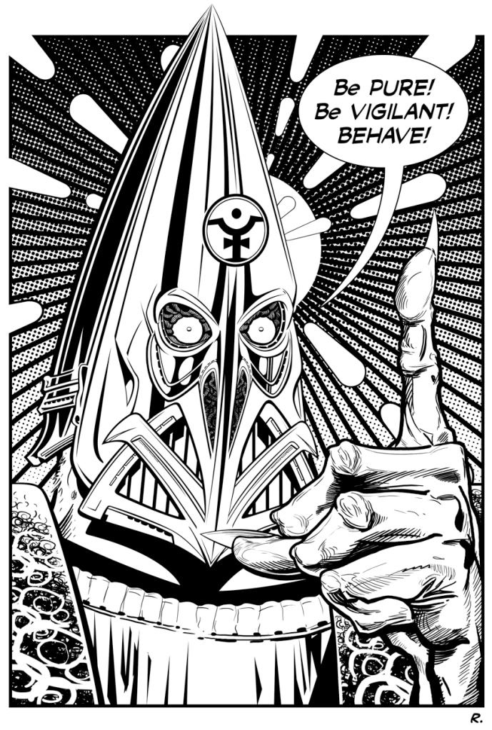
I ran out of time in the last week to do something new so I've dipped back into my archive and found this picture of the villainous, fascist, racist and religious leader of the future human race Tomás de Torquemada. This nut case of a man became one of 2000ad's most popular characters and was the warped and evil child of writer Pat Mills and artist Kevin O'Neill appearing in the series 'Nemesis the Warlock'.

This was drawn three years ago for the last issue of a fan made magazine called 'Eagle Flies Again' which celebrated not only the 80s version of the Eagle comic but all British comics. As a farewell they asked for contributions from writers and artists and I picked Tomás here to deliver a message to them. I've updated the text for this viewing to one of his more familiar rants. This image was also a first for me in that it has been the first (and so far only) time that I've inked a piece entirely on a computer. I know many artists have moved to using a computer for inking and I'll admit that I've yet to try the much talked of 'Manga Studio' for this process but I still prefer to work with a brush or pen and have a material object at the end of the process.

Monday, August 24, 2009

JonDay: Never before seen

So usually I flagrantly flout the basic idea of Scotch Corner and post work I haven't made this week. Needs must when the devil drives or whatever that piece of homespun wisdom says. What does it even mean?!

Nevermind that. Here's something I'm working on right now, for myself, which hasn't been seen anywhere else yet. Its the first in what will be a series of images I'm making for a slightly different market than usual. I've had an absolute blast working up some large scale widescreen images just like this one for a super secret project, but it could be months even years before I can share those, or even the name of the project. Which was vexing me slightly, until I realised that it is well within my power to take what I've learned with those images, twist the content to a wider theme and voila!

There will be a figure or two in there by the end, but for now it's just the landscape. This is all ArtRage so far, with a teensy bit of Painter, but not so much as you'd know. Of course, because it fits the idea of Scotch Corner so well, the format of the image, by the power of Sod's Law is utterly unsuited. But hey, we're all friends here, right? What's a couple of gigantically wide images between pals?

Image Hosted by ImageShack.us

Ye Bigge Thumbe Naile:


Don't forget you only have a few days left to enter the first print contest. So get to it! Click that thar button over yonder ->

Sunday, August 23, 2009

Sunday Guest Post - Vicky Stonebridge!

Not only is our guest contributor Scottish but she's probably one of the busiest people I've ever met and yet she still found time to paint us this wonderful painting!


It’s quite an honour for me to be asked to guest here as I suffer from that familiar artists affliction of not being good enough, not being a proper artist, illustrator, painter, potter, tea cosy knitter whatever. Specialisation was never a North west coast option, with no jobs, crèches, transport, shops or handy skips, one has to bodge, adapt and make do. This I think is why I find myself spread so thin between event organising (especially Hi Ex), youth work, craft making, painting, fire fighting, teaching etc etc. so many hats to wear and never time to worry about whether they fit. The good thing about this is that life is never boring! I also like that all the different jobs need a different part of my brain; highland cow and sheep painting for the tourist demand uses the cynical part of my brain, crafting is therapeutic, teaching keeps me on my toes, comic strips stretch my technical skills, painting figurative or landscape canvases uses the manic obsessive part and so on. But somewhere in there lost in the bustle of grown up life is a pantheon of characters from folklore, animals and small people who just want to play in the lost corners of the highland landscape.

As a youngling I made, painted (and saw) fairies all the time, but of course teachers and college would have none of such whimsy. Little did we know how mainstream and popular they would become, horrible naked bad taste glittery gifs adorning a thousand myspace pages and bad tattoo blogs, I could have made a fortune if I’d stuck with fairies, but they ran away from me and became tamed, no longer the malevolent creatures hiding in remote glens which I’d carried charms against as a girl. So it is with trepidation that I now have a go at fairies, they are from a playful childish place, mermaids, kelpies and big cats lurk in the darker places, just left of the accounts, behind the housework and often at www.balnacra.com.


Many thanks Vicky! And remember that anybody can take part in Scotch Corner and become a guest contributor (yes, we mean you reading this!) so click here and take part!

Friday, August 21, 2009

Triple X

A few X-Men doodles from my sketchbook this week: Jubilee, Professor X and Jean


Thursday, August 20, 2009

Transformers - Robots in Disguise.


Occasionally I get the opportunity to work on some really cool toy licences and film related properties. The most recent (and fun) has to be the Transformers series for Titan Books. Have included a cover from last year of Ironhide smiting some poor soldiers (in the wrong place at the wrong time) Ironhide is probably my favourite of the new movie designed Transformers. Nice porportions to him and some cool artillery on those shoulders.
I would normally work through a variety of sketches for my editor Steve White, trying out different angles and compositions of Ironhide and the figures and vehicles. My brief was simple but specific (as it had to relate to the interior art and story) Not as restricting as you might think but thankfully the tanks were easily referenced and the desert background wasn't too much of a worry either.

Editorially there were a couple of subtle changes of tone (mainly with the soldiers jumping from the tank and those attacking Ironhide) Once the inks have been approved (see below) then it gets sent off for colour. For this piece I choose Chris Sotomayor (who I had previously worked with at Marvel) for the job. He had shown a good range and variety of styles on the Zemo: Born Better series I inked with Tom Grummett previously and was perfectly suited to colour this image. The detail he put into the finished cover was astounding but didn't over-power the main image. The scuff marks on Ironhide's feet and scrapes on his armour in particular (check the door edges) were lovely. It's that attention to detail that heps the overall finished cover work and I am really pleased with the end result.

For the Titan Books release they included the cover as a centre spread and it was a treat to see it properly (without logo, free toy and blurb)


Wednesday, August 19, 2009

More Exalted

One of my favourite images for the Exalted line of RPG books, from White Wolf, an Abyssal Exalt summoning a surgically altered bird of prey. Again, this is digital paint over a pencil drawing. (C) White WOlf CCP 2009

Tuesday, August 18, 2009

Mr Cawber visits the 13th Floor!

comic,Graeme Neil Reid,13th Floor,scream,illustration

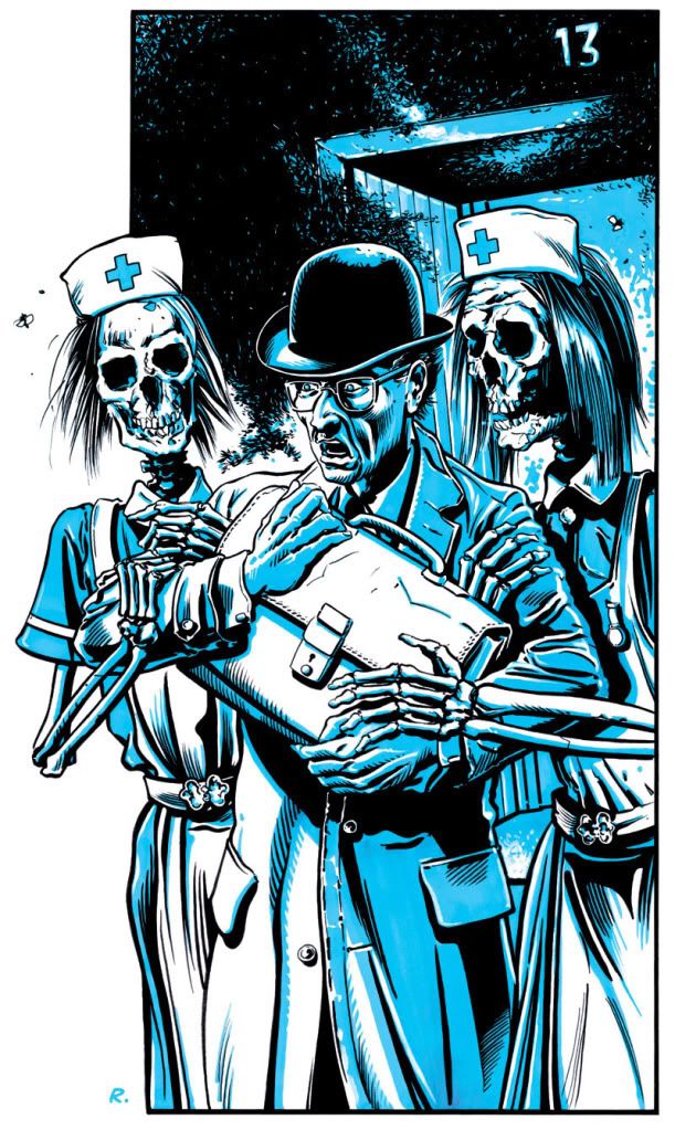
Following on from Tom's painting from the film 'Scream' a couple of weeks back here's an illustration from the series 'The Thirteenth Floor' from the UK weekly comic 'Scream'. The comic was very short lived lasting only fifteen weeks back in 1984 but a large portion of the strips went onto appear in 'Eagle' and where very well received.

The Thirteenth Floor was written by Judge Dredd writers John Wagner and Alan Grant under the pseudonym Ian Holland but the stand out item for me was the art of Spanish illustrator José Ortiz who just breathed life into the strip. The story centred around an apartment building called Maxwell Tower where a 'big brother' style computer called 'Max' looked after the welfare of all his residents. As with a lot high rise buildings, due to superstition, the 13th floor of the building was missing from the elevator listing but if you crossed Max by upsetting any of his residents then you could be sure to visit that missing 13th floor. As was the case for bailiff Mr Cawber whose visit to Mr and Mrs Bickle in apartment 4F caused much distress for all involved, needless to say Max sorted it all out.

Monday, August 17, 2009

JonDay: Forgive me John Constable

For I Have sinned.
Image Hosted by ImageShack.us

Cover to the forthcoming Cthulu Britannia from Cubicle 7 Entertainment.

Clicken Sie für der Biggar:

Friday, August 14, 2009

A Nation No More

For personal reasons i wont be able to create brand new content for Scotch Corner over the next few weeks, so it's an excuse to unearth some old stuff. So here's 7 pages of some sequential stuff done for a small independent quite a while back that didnt really go anywhere. A 50 page special first issue was created for the"Funky Space Nation" - a cross media project with a pop superhero group as the characters - think they had one single released - not sure if it charted or not though. Click on the images to get a better look. (Inks are by John Erasmus)


Thursday, August 13, 2009

Mystique?


Not really. But I couldn't resist adding this obligatory cheesecake image for my regular Thursday post. Still colouring here and there whenever the opportunity arises and decided to go for a simple girly pose.

Fairly simple process of drawing the lineart and scanning in to Photoshop. The line art is then saved as a floating layer and the colour is applied underneath. Very similar process to the old school approach of using an acetate sheet with the painted artwork below. I still use a mouse to colour (not easy) although I am considering learning to use the pen and digital pad that has been lying around new for the last couple of months in the studio. Yes, it has been a very busy month. Worked up some Grrrl textures for the top and gave her a blue tinged skin for effect.

Very pleased with the end result as this sort of pin-up style is not the sort of thing I get much of a chance to do.

Wednesday, August 12, 2009

a little bit of process

Putting up an image today which shows a little bit of what I'd like my typical process to be. I say "like my typical process to be" because to be absolutely honest I rarely do things the same way twice in a row. I do usually sketch in pencil, and often do a warm ochre-ish under painting, but after that it starts to vary.

Sometimes I'll work on a 'multiply' or 'overlay' layer of colour, or sometimes (in this case) opaque paint straight away. Often its easy to get pulled into details right away and concentrate on the image section by section, but here I tended to work on the image as a whole, which is considered the more correct way to go.

Another card for legend of The Five Rings (working on an NDA'd project for the last 4 months...) today, character art showing a Matsu clan archer. (C) Alderac entertianment 2009

Tuesday, August 11, 2009

The crime is life, the sentence is...

Judge Death,2000AD,Graeme Neil Reid,Sci-fi,Painting,Comic

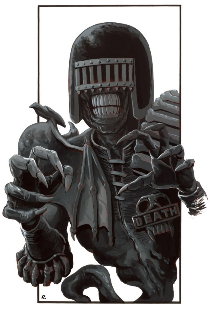
Most UK comic book readers will know who this is but for those who don't its the arch-nemesis super villain of Judges Anderson and Dredd from the weekly comic 2000AD who goes by the catchy name of Judge Death. He's like a zombie version of the title character Judge Dredd thought up and drawn twenty years before the US comic market went crazy for zombie comics of their own popular characters. It's not a new idea by any stretch of the imagination but it is a popular one.

Again, this is a painted version of a previous pencil sketch I produced and was painted purely in acrylics this time on an A3 sheet of paper. Good fun slapping paint down on this one and I think I managed to get some good detail in without feeling the need to go too fiddly and minute. I'm still on the hunt for some reasonably priced paint brushes though as my trip to the art shop brought on phrases like "Holy Cow, look at the price of that!", when did paint brushes become so dear? And as a true Scotsman my kilt purse stayed tightly closed.

Monday, August 10, 2009

JonDay Again!?

How did it suddenly become Monday again? Yeah I know I know rotation of the earth and all that "the world is actually a sphere rotating around the sun" nonsense they brainwash you with in school.

Anyway I guess this means I need to post something!

Here are a bunch of portraits I've produced for an author friend's epic sci fi project, the Valentine Chronicles. A definite departure for me, since I don't often draw scantily clad ladies. Though one of those ladies seems to have a =very craggy face and a handlebar moustache!


Image Hosted by ImageShack.us

And the clicky:

Sunday, August 9, 2009

Sunday Guest Post - Dave Hitchcock!

This Sunday we are treated to a new page of comic art by a master of the UK's small press/independent press scene. As you'll read Dave has been involved in creating his own stories for a long time and his work just gets better and better with each story. A distinctive style, impressive design, layout and execution of his art are not the only weapons in Dave's arsenal he's also an entertaining and imaginative author and I can recommend tracking down his back catalogue to anybody. Here's what Dave had to say for himself:


Thanks for giving me 'Adopted Scotsman' status! When I was asked to participate in this great site I hadn't got a clue what to write about, then it dawned on me that I'll be celebrating my 10th year in self publishing (I'm not counting the photocopied stuff I did before that). Ten years, jeez where does the time go? My first book was SPIRIT of the HIGHWAYMAN, which seems to have become somewhat of a cult item nowadays. I followed that with WHITECHAPEL FREAK, and then a few years after came SPRINGHEELED JACK, with a few short stories dotted about here and there. Currently I'm drawing a samurai tale which is fairly hush, hush right now, so I can't say that much about it but here's a recent page anyhow. After this I would like to get back to SHJ at some point but with Diamond (the comics shipping catalogue) cutting off most small press publishers, even though they take the lion's share (60 per cent) it could well be back to photocopying again, as most print costs do relay on big runs to make them cost effective.

Actually though, it might give a creator a little 'exclusivity' back again eh? What do you think? Is a photocopied small-numbered run the future for small press?

This has just reminded me that a few weeks ago there was a GLOWING article on the net about DC's WEDNESDAY COMICS, a newsprint title which is selling like hot cakes. Diamond would not list my last endeavour, GOTHIC....BECAUSE it was on newsprint! It was a collection of old and new stuff, more a 'portfolio' if you will, which even had a Mike Mignola quote on the front, I thought by having his very gracious remarks gracing the cover it would shift a few. So far I've had to hawk them round shows myself, and I've still got a good 1500 in neat bundles in the spare room. I didn't mean to turn this into a gripe, blame Previews, I'm sure many small press publishers are in the same boat.


Many thanks Dave, not only do we get to see an exclusive new page but you also manage to get a swipe in at Diamond for abandoning many brilliant small press publishers. You can keep up to date with Dave's work at his website, be sure to check out some of the amazing private commissions he's worked on.

And remember that anybody can take part in Scotch Corner and become a guest contributor (yes, we mean you reading this!) so click here and take part!

Friday, August 7, 2009

First Stab

Stab as in the movie within the movie from the Scream Trilogy and also because this is my first stab at using Artrage. I needed to create something quickly and totally digitally this week as i'm off mucking about with the kids for a week and my home scanner has given up the ghost.

Jon's earlier post led me in the direction of Artrage and so i downloaded the limited trial version. Considering the price it's a pretty nice and intuitive bit of software and i will probably shell out for the full version as i can see me using it again. I pretty much got the feel i was after for this image without too much grief although i did cheat a bit and added the bloodsplats and drips from the knife in photoshop just to save me some time.

Definately a nice tool to add to my arsenal and i'm sure once i get round to ditching the mouse in favour of a tablet and pen it will be even better.

Thursday, August 6, 2009

Alien. 1998.


Always loved the original HR Giger design and was fortunate enough to see the Giger film exhibition in Frankfurt earlier this year. Some absolutely gorgeous designs on display, original art which was breathtaking and video features and sketchbooks from the man himself. A truly frighteningly creative man (and a bit scary too) They even had the actual Alien costume (possibly the stunt version?) suspended behind glass. The suit was a little worse for wear with some minor tears here and there but in not too bad condition considering it's age. Even behind glass it was an incredibly potent and startling design and the tail is a lot longer than you think it is. Mhairi certainly couldn't look at it long enough before moving on and that was in a stark white-walled gallery as opposed to a dark strobing corridor with sirens blaring! A missed opportunity for the gallery owners there?

This is my first (and at present, only) illustration of the Giger Alien. As much as I like the rest of the movies (yes, even the third and fourth for different reasons) the purity of the original design is something to behold (and draw) Especially the sleek long head that seemed to disappear to a more skeletal design in later incarnations. The Dog Alien in Fincher's part of the quadrilogy however was particularly interesting. Maybe a colour piece to follow?

This image is mostly drawing. Some quick Photoshop for background sky and form but no digital pad. Just pen and ink. Would love to do some more work on the character and property as it is a genre I am very much like and look forward to the Blu-Ray release of the Ridley Scott version later this year. A near perfect genre movie.

Wednesday, August 5, 2009

Comical Andy

A page from a comic I try to work on in my spare time (though there is precious little advance in the number of pages of late). I really get a kick out of writing and drawing comic pages, but my main business is illustration, so much less specialized than the discipline of sequential work which perhaps is a slightly different skill set to my normal work. But its a skill set I enjoy exploring whenever I get the chance.

Again, digital tone on top of a greyscale pencil drawing, mostly done with Painter 9.5 and a Wacom Intuos 3.

EDIT: image removed during a routine clearout. noffink to se here...

Tuesday, August 4, 2009

Sir Winston Churchill and the Ministry of Space

Graeme Neil Reid,Sir Winston Churchill,Ministry of Space

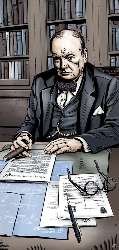
I knew I wouldn't have time to do a painting this week so decided to do a pencil drawing of Britain's famous Prime Minister. Trouble is once I'd done it I fancied inking it and then I felt like colouring it too so by the time I'd done all that I might as well have done a painting :)

Anyway, I've wanted to do a picture of Churchill for a long time and I got several chances to do so in The Dangerous Book of Heroes that I illustrated recently but the chapter featuring Sir Winston only concentrated on his life before his political career and so I missed the chance to draw him as most people would recognise him.

So this picture fulfilled that need and it also lets me pay homage to a great comic book series called 'Ministry of Space' written by Warren Ellis. It was a three issue series published by Image Comics and you can now buy it as a graphic novel. In the story Air Commodore John Dashwood approaches Sir Winston Churchill to commission the creation of the Ministry of Space and claim everything beyond this Earth for King and country and the British Empire. But there is a twist of course and I recommend that you check it out. The Ministry of Space is the kind of comic story that I'd want to create and features the lovely art of Chris Weston drawing World War 2 planes and British Spaceships, who could ask for more? Oh, and I think that a certain Scotch Corner contributor helped out on some inks in this series? But I could be wrong?

Monday, August 3, 2009

Holy Heck it's Monday!

Afternoon all!

Last week I got my complimentary copies of The Eberron Campaign Guide from Wizards of the Coast. So I'm safe to post the couple of pieces I did for that book.

Image Hosted by ImageShack.us
(C)2008 Wizards of the Coast. All Rights Reserved

Bigger version is hier:


It's funny, the lead times on those books is so long that the work feels very alien to me by the time it is released. Hey ho, all part of the job.

I've also been messing about on Ustream. You can see my initial crash test dummy run here: http://www.ustream.tv/recorded/1861443 wherein I paint a really rough face in 6 minutes or so in Artrage.


Saturday, August 1, 2009

August Competition – 'Dragon Rein' by Jon Hodgson

We have a new competition for all followers of our humble site, each month there will be a fantastic prize supplied by one of our contributors which you'll get a chance to win. It couldn't be easier to enter, all you need to do is leave a comment about the prize and you'll be entered into the running. Any kind of comment counts but you have to make sure you think about it as you can only enter once, so make it funny, make it complimentary, make it a song, make it weird, make it anything you want but make your comment count.

To start us off Jon is supplying something very special and I'll let him tell us a bit more, take it away Jon!


This is a 60 cm x 30 cm print on really heavy, glossy poster stock. It features artwork which was used on the cover of "Dragon Rein" by David F Berens. An ancient and evil sorcer-king surveys the lands under his thrall beside his equally ancient, though considerably less evil, dragon mount. The print is a crop of the full painting, which was considerably wider to wrap around the novel cover front and back. It was made in Painter and Photoshop last year, and I think for me it was something of a milestone in adding details, and generally producing tighter work than what had gone before. I have one of these very prints hanging in my toilet. So far there are only 5 of these in existence, and the prize is signed and numbered print two of an open edition. It's not a strictly limited run as such, but there aren't many about, and never will be!

Click on the preview image box to see a larger version of this great image!


Terms of entry: 1. Only one entry per person. 2. Comments must be left by the end of 31st August 2009 to be entered into the competition. 3. The contributors to Scotch Corner will judge the comments left and decide a winner with the contributor supplying the prize having the casting vote. 4. The winner will be announced on the website as soon as a decision has been reached. 5. If the winner does not have a contact email address available on their comment profile then it is the winners responsibility to contact Scotch Corner at scotchcorner@me.com and supply mailing address details. 6. If the winner does not contact us after one full month a new winner will be chosen. 7. All decisions are final. 8. If you are unhappy with any of these conditions please do not enter.