Friday, December 30, 2011

The Incomers


The Incomers by Moira McPartlin is one of a few book jackets that i've done over the last few months and this is the first one that i am allowed to show as it is now available on Amazon for pre-order. The author and publishing house wanted it to look different from everything else on the shelves in that genre and so we ended up going down the route of more is less and using bold flat colours and ink outlines. I think it does the job. You can find out more about the book and pre-oder it on Amazon here

Happy New Year to all!

Wednesday, December 28, 2011

Montage!


A little montage of some older, previous works, including pics from Cubicle 7, AEG, White Wolf, and Spiral Direct.

Tuesday, December 27, 2011

Christmas Angel

MeanMachineXMAS_GNREID.jpg, www.gnreid.co.ukMerry Christmas everyone, see you in the new year if Mean Machine doesn't get you first!

Sunday, December 25, 2011

Saturday, December 24, 2011

Clearing the attic

I've started clearing my old stuff out of my parents house. Most of my old work is going in the bin , bit occasionally I find something I quite like. This is a portrait I did of my friend ( writer, filmmaker)  Colin McLaren.  It was part of the design process for a Theatre poster I designed for his production of Hamlet ( he starred in it) . I went a different way with the final poster, more austere and symbolic.


Friday, December 23, 2011

Judge Dredd (reimagined)


I've come across a few sites recently that 'recreate' existing characters just for fun (Project Rooftop etc.) and thought i would participate in some work along those lines. The Whitechapel site were doing a Judge Dredd one last week so this is my redesign from that.

I reckoned that i probably had three options:
1) Tweak and revise the existing design (seemed a bit pointless)
2) Take a more conceptual approach (i did doodle some blind justice style ideas where his eyes/head were masked with cloth - like the statues of a woman holding justice scales but just thought ideas like that would be too impractical for Dredd's environment)
3) Take a more practical 'realistic' approach

I went with option 3 and decided to start from scratch basing the design on a hi-tech evolution of a riot cop (i guess an obvious route to take but it made the most sense to me). The helmet now includes various technical capabilities such as gas mask/filtration system, comms system and night vision/infra red etc. The body suit is armoured and padded for day to day violence and the truncheon is barbed, spiked and electrified. Debated on keeping it mostly black and navy etc. but thought i would transfer over some of the colour from the real Dredd costume.

Quite fun to do, so i may do some more of these next year.

Thursday, December 22, 2011

Roller Grrrls! Eerie Erin sketch.


Recently (when I have free time) I have been working on a roller derby comic (writing and drawing mostly) with my wife Mhairi and storyboarding colleague Anna Malady. We are also aided by the brilliant Yel Zamor on colour and the talented Abby Ryder on Lil Rollers. You can see more images and covers when you visit the Roller Grrrls hub at rollergrrrls.com.

This image here works well as a 'time out' piece from the main story. Erin waits her turn to enter the play. It captures the downtime perfectly and is so much more satisfying an image to work on than spandex heroes destroying giant robots and buildings. Very pleased with this image.

Visit the hub and LIKE the Facebook page. Comments welcome and we love feedback!

Wednesday, December 21, 2011

H is for Hussar!


An officer of the 7th Hussars, (although I think a liberty or two was taken with the uniform - with the dimensions of the fur cap especially) for a comic I hoped to do years ago - sadly I found it impossible to eat into the 100+ pages I unwisely set myself...

Tuesday, December 20, 2011

H is for Hulk (again)

HULKrage_GNREID.jpg, www.gnreid.co.ukI've already drawn the Hulk and posted it as part of the Marvel A-Z but hey I've done it again. Lots of colour Copic Markers and hardly any black ink, good fun to draw.

Friday, December 16, 2011

Doctor Who buddies


Some more emoticons, this time with Doctor Who characters. No time for chat just now as off for Christmas 'lunch' so best to post this before i go as i may not be in a fit state later.

Thursday, December 15, 2011

Claire Bennet, Heroes. Sketch.


A more whimsical sketch from Paris Manga. This was for a father's daughter who loved Claire Bennet, the cheerleader from Heroes. I asked her (in French) whether she wanted to see the gunshot and she nodded. She was about thirteen years old. Cool kid.

Wednesday, December 14, 2011

Cyberpunk Dude


A dude from an old Cyberpunk comic I was fiddling with a while back.

Tuesday, December 13, 2011

Starblazer 'Rocket Age Adventures'

StarblazerRAA_GNREID.jpg, www.gnreid.co.uk


I like writing these kind of posts, I wrote one last year with my first work for 2000AD under my belt, it's a 'dream fulfilled' or 'mark it off the wish list' post. 

Back on January 25th 2010 I wrote a piece about a painting I had produced in homage to 'Starblazer' the digest sized sci-fi comic published by DC Thomson Ltd in Dundee. The post and painting received a fair amount comment and coverage from around 'the net' and I was lucky enough to see the image 'Stone of R'lyeh' published in the book 'Sci-fi Art Now' from Ilex Press.

As I stated in the post Starblazer ceased publication back in 1991 and DC Thomson has no plans to resurrect the title but if you read through the comments left you'll see a conversation about the roleplaying game 'Starblazer Adventures' from Cubicle 7 Entertainment Ltd. The writer of the game, Chris Birch, talked about why licensing Starblazer from DC Thomson worked for them and how, like myself, he had very fond memories of the comic. I've had the pleasure of producing a few pieces for Cubicle 7 in the last year (fate is a strange chap as fellow Scotch Corner contributor Jon Hodgson is now the Art Director of the company) and when I was asked if I was interested in producing the cover for a new Starblazer supplement I couldn't turn it down.

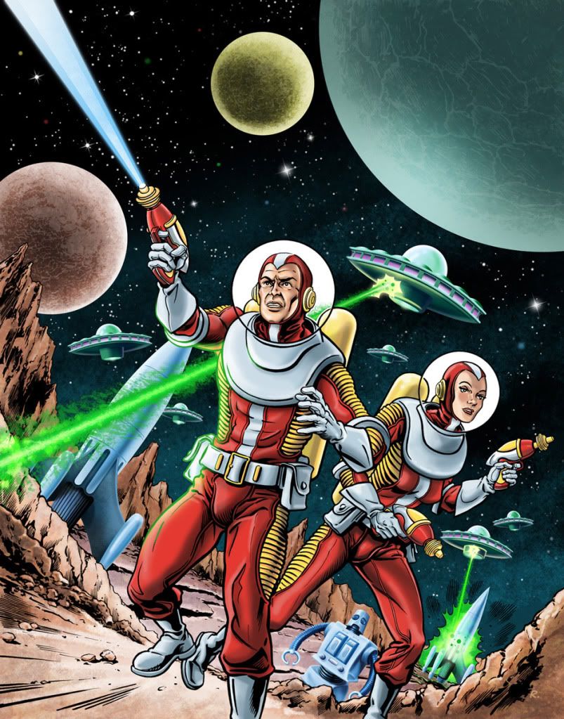
The supplement is called 'Rocket Age Adventures' and it allows the gamer to use the Starblazer rules as a more retro sci-fi, pulp style rocket ships and rayguns game. The brief called for "a nice dynamic piece with a load of rockets and rayguns and mysterious bulbous craft all coming bursting out at us framing a male and female character in nice rocketeer, bubble helmet style."

Sometimes I know exactly what I'm going to draw and the trick for me is to try and live up to my own vision of how an image should look. Artists and other creative people have been known to be notoriously critical of their own work and its understandable that if what's on paper doesn't match your own vision of how it should look that you will be negative about your achievements. I knew pretty much from the outset how I was going to be approaching this and my initial sketch was approved with one change… to add in another rocket.

StarblazerRAA_SketchPencil.jpg, www.gnreid.co.uk

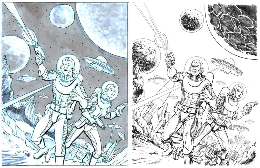
Onto the pencils and as I have tendency to produce very tight pencil work it was a good indication for the client to see how the finished illustration was going to look. I then inked and set to colouring the piece. I wanted to have a marked difference between the man and woman and the elements that surrounded them so I kept the characters and the rocky planet surface in their original solid inked style but the rockets, robot and saucers I decided to paint and drop the inked line to give them a different kind of look. I had a lot of fun adding in little touches to this cover and by the time I'd finished I had decided that for me it's the best illustration I've produced this year, I think I nailed it on the head for this one and I'm very happy with it and thankfully so was the client who gave me special permission to show it off.

So in a very rare event I have a cover I'm very happy with, that the client loves and, although the comic disappeared 20 years ago, I think this could be about as close as you can now get to saying you've drawn a cover for Starblazer. Not bad I reckon.

©2011 Cubicle 7 Entertainment Ltd.

Monday, December 12, 2011

Jonday: WWC

A piece of video I made for Cubicle 7, to promote an upcoming game, for which I also made the cover. The cover is not yet cleared for display, but you'll get the gist of it from the vid:

Sunday, December 11, 2011

Friday, December 9, 2011

T is for Throg - Frog of Thunder


No idea why i decided to doodle this - just one of those random things that came into my head. Way back when Walt Simonson was doing his legendary Thor run he decided to have some villian mystically turn Thor into a frog for an issue or so - i pretty much thought that was an end to it but when double checking the costume i found out that Marvel now have a permanent character like this.

Thursday, December 8, 2011

Catwoman_sketch.


I normally don't like showing the 'process' as some of the early sketches always look so very rough and, well... bad. These failed attempts at something better always get hidden in a drawer or trashed. The reason? Well, I constantly change poses, elements and rendering while I draw and these initial ideas never show the full potential. More so when shown out of context of the finished image.

This sketch of Catwoman (part of two ideas I worked up for Paris Manga) has a Parisian flavour about it and still pleases, even at this raw stage. There is a suggestion of a short story too which also helps. Compositionally though it is nearly there. Some nice angles and shapes created by her legs, back and the buildings!

I normally start with a little thumbnail (seen bottom right) and use that as reference for larger sketch. Ideas are added, changed and occasionally overdrawn. There was a proper inked pass done of this pose at an event but I forgot to take a picture of it, sadly. The legs were slightly different and she was more recessed into the window frame (allowing for some rather complimentary underlighting of her quite lovely bottom) The pose was also more arched and curvier all round.

The second idea from this series was of Catwoman at the Folies Bergere and was rather saucy. Possibly working that up into to a print for next year's Paris Manga show. A sketch might be posted before then.

Wednesday, December 7, 2011

Stop badgering me!


Another illo from my C+S days. I'm not quite sure at the time that I understood what a Japanese badger-man would look like, and now I would do this pic very very differently. But hey. Live and learn! And use the internet for research...

Tuesday, December 6, 2011

Wheee-Doggie!

MeanMachine_GNREID.jpg, www.gnreid.co.uk
Ya dirty stinkin' judge hat! Nobody stares down Mean Machine Angel!

Monday, December 5, 2011

Sunday, December 4, 2011

Bondage

This promo image from earlier this year took it's inspiration from the Bond movie credits and the colour washes used in the title sequences of the Good The Bad and the Ugly.
Photobucket

Saturday, December 3, 2011

Florida Loser Noir

A quick character sketch. I've been reading some Elmore Leonard lately.

Friday, December 2, 2011

The Joker - well, kind of


I stumbled over a website recently that was running a comic art competition which basically involved creating a female version of a male character. They supplied a fair selection of images to choose from to use as reference material - i think to draw from rather than manipulate as i have done - but as i had missed the deadline anyway when i found the site i thought i would just have a play with some photo manipulation. I decided not to go too OTT with this one and tried to keep the changes reasonably subtle so that it still looked like it could have been done as a make-up photoshoot - the original image is posted here too so that you can see any edits i made to the model (eyebrowes, mouth etc.). Might add a few more of these to my to do list to keep brushing up on my photoshop skills.

The Thing! Sketch. Paris 2011.


Ben Grimm. The Thing. This is the last of four sketches for Dominique Brucato at Paris Manga. He has been patiently waiting six months between characters and each has proven a challenge. Starting with the Invisible Girl, I painted her in reverse (with light) as white paint on black paper. Johnny Storm was inked purely in flame, with no outline. It proved a favourite and was very kinetic and full of energy. Mr. Fantastic was a more playful image done in the style of Bryan Hitch. Maybe I'll post that one another time?